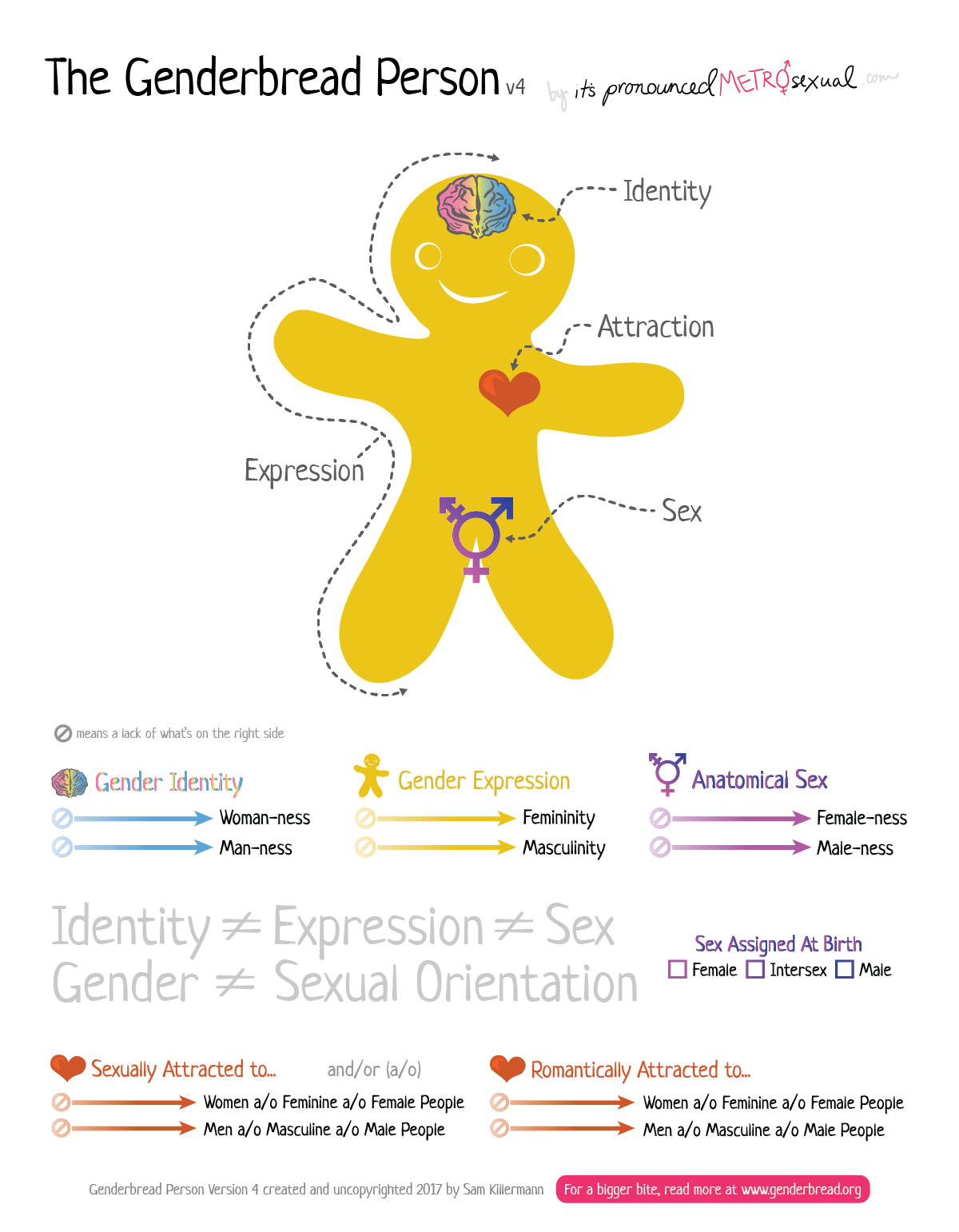
A few hundred workshops, three years, and one book edition later, I’m happy to finally publish here my 4th version of the Genderbread Person. Check it out, download it, and share it with your educator friend who is still using v3.x and say “well, actually…”
You can also head over to Genderbread.org, where this version (and some others) will be available, in all of its forms. Or just click the big pink button and get a folder including all the graphics in this post.
While you’re doing that, I’ll explain what’s changed, why I changed it, and some thoughts regarding this little cookie in genderal.
The New Ingredients: What’s changed and why?
I explain way down below a bit of my rationale on how I make changes to the cookie, but there’s one big thing I don’t say there that makes more sense here: this version of the Genderbread Person (like all my versions and subversions since 2.0) is workshopped/tested/tweaked for quite awhile (in this case, years) before I publish it here, almost entirely queer (and mostly trans*) educators/feedbackers.
The changes I explain below are what resulted from that process, and reflect something that isn’t perfect, but is an improvement upon 3.x, a forever work in progress, and the best me and the people providing me constructive criticism could do right now.
Let’s start with the most obvious, then I’ll move into the litany of subtler changes.
Vertical layout, 8.5″ x 11″ format (also more A4-friendly)
This change was, in hindsight, a gimme: it’s something that no fewer than 1,000 of you emailed me requesting; it’s the way most people were printing the old (tabloid, 11″x17″) version anyhow; and it’s also how Meg & I at the Safe Zone Project had been doing Genderbread Person for years. So. Well. Erm. Sorry it took so long?
This also allows for easy top-to-bottom, left-to-right reading/facilitating. The top half of the paper and the bottom half are two completely separate lessons (components of gender; those components visualized on scales), and can be easily treated as such.
Sex Assigned at Birth AND Anatomical Sex
A lot of people have been pushing for me to remove the anatomical sex continua and reference sex assigned at birth (SAAB) only. Others really find the benefit of discussing the variations of anatomical sex using continua, and have argued for that for years.
I’ve listened in on this, tinkered with lots of versions of the Genderbread Person that reflect each side of the debate, and tested both a bunch in the classroom (and heard from lots of you doing the same), and here’s where I finally landed: like so many social justice things, this isn’t an either/or situation, it’s a both/and one.
Contrasting between one’s sex assigned at birth and one’s anatomical sex, it turns out, is really helpful for a lot of people to better grasp the idea of sex. Sometimes we’re talking about sex assigned at birth, and a lot of other times we’re talking about the anatomical sex that someone embodies (which changes, for all of us, throughout the course of our lives — although that change is, for some of us, more drastically, or for different reasons, than others).
This nuance can help us all better understand ourselves, and the specific ways we might be misunderstanding, excluding, or misgendering others.
There are tons of examples that I’ve heard and used, but, for the sake of keeping this announcement relatively short, I’ll let you come up with your own here (and let me know if you want me to write an article walking through this distinction).
A Few Big, New Words
In gigantic letters, between the gender and attraction continua, we have “Identity [does not equal sign] Expression [does not equal sign] Sex”, and “Gender [does not equal sign] Sexual Orientation.”
A lot of people experience two simultaneous, but seemingly contradictory feelings, while walking through the handout: “Yeah, that makes sense” and “omg wtf this is so much to comprehend WHAT IS LIFE.”
The idea here is to provide a simple takeaway, that’s relatively absolute and dualistic, to help the people who feel lost in cognitive complexity after the gender continua.
Think of it as the “lowest bar possible to clear, in order to take something beneficial away from the handout.” If someone walks away thinking “there are these different components of gender, and they’re not all necessarily the same,” and that’s it, fine. Step one in understanding: check.
It started as a sort of inside joke, then it became something I (and Meg, and then a bunch of other educators using our Safe Zone Curriculum) did every time I was using Genderbread. Then when I asked people to test out version 4 (who were using 3, or 2, or 1), it was the only thing that got absolutely zero pushback.
But Fewer Words in General
I tried to remove explainer words where they weren’t needed, and remove a lot of the specialized vocabulary. This has two benefits: (1) it allows for the person viewing it [or being taught it] to imbue it with their language; and (2) it makes for easier translation [something I’m never able to keep up with, but hopefully this helps].
There’s still a version with all the words for people who want it, which brings me to…
3 Different 4s
Want more words? Worry not, friend. With the fourth version of my take on the Genderbread Person, I’m throwing in the towel on something that I’d been fighting for with the past 3 versions: the idea that any one graphic will work for everyone.
I’ve tested this idea with some later subversions of Genderbread Person 3 (3.2, 3.3), releasing a “minimal” version, in addition to the “full” (verbose) version, that a lot of folks found helpful.
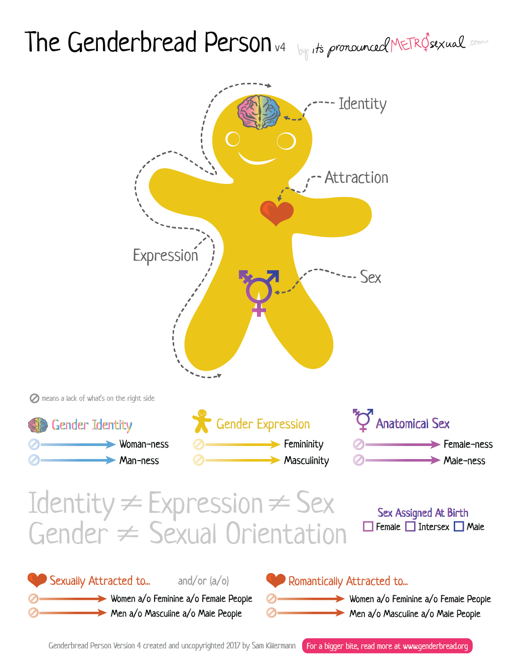
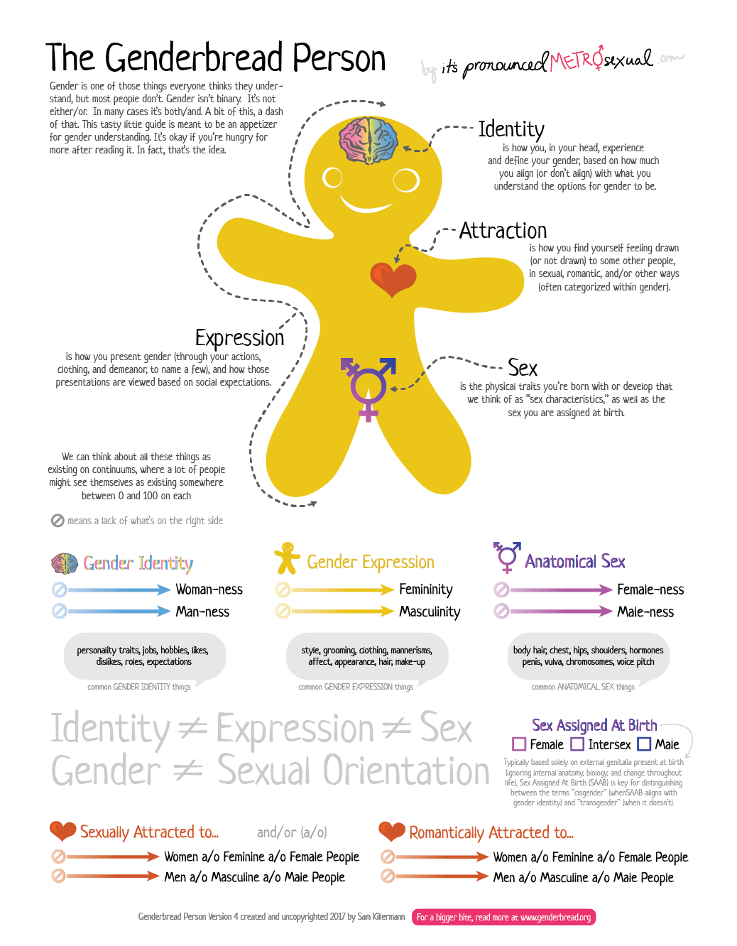
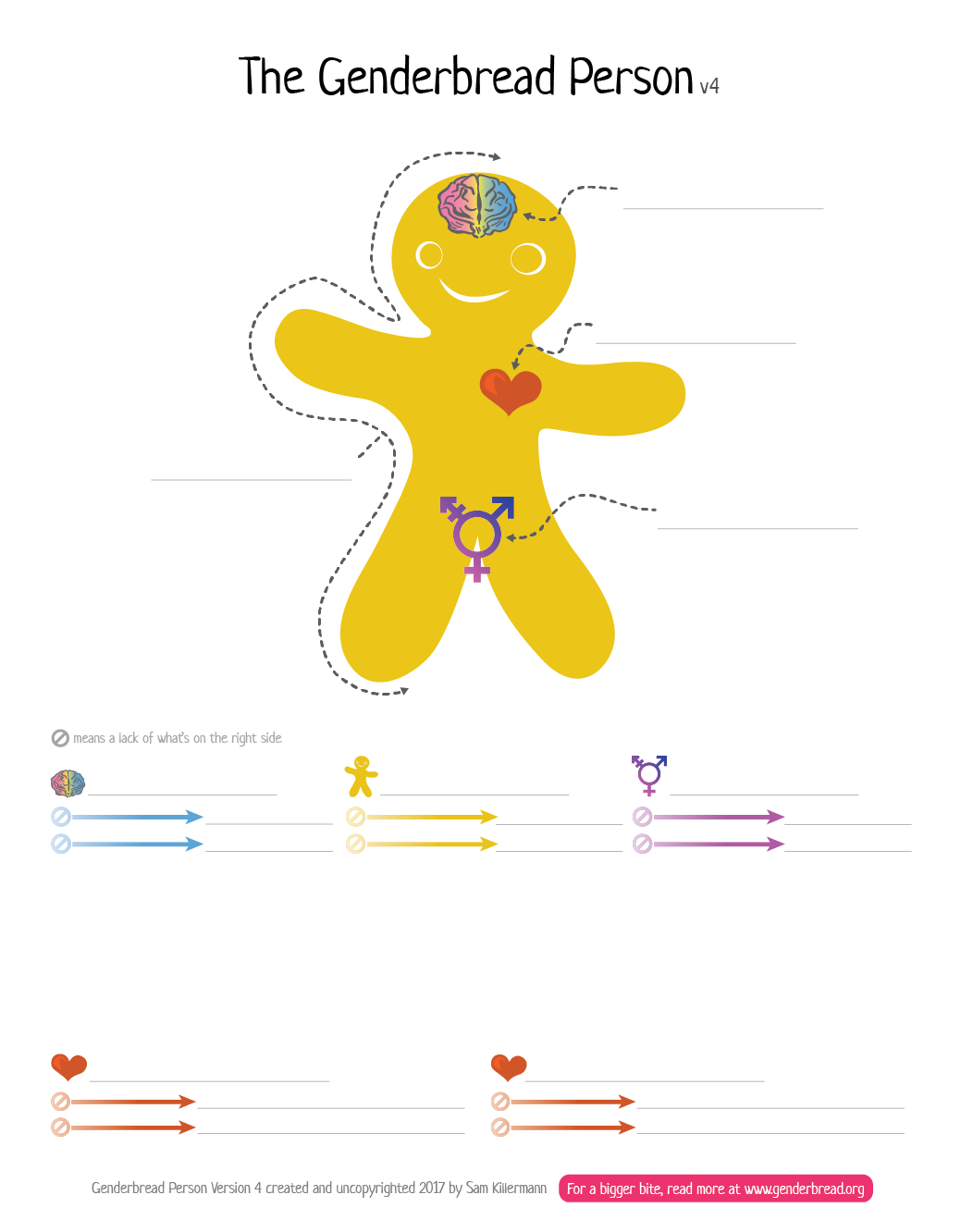
Embracing that, as you’ve likely already surmised, I’ve created 3 distinct platings of the Genderbread Version 4. They are all modular, made from the same ingredients, and can easily be remixed, mashed, or delivered á la carte:
- The “Standard” version, with fewer words, and meant to be used alongside some other explanation. Great for talks, teaching, essays, blog posts, etc. Not so great for hanging on a bulletin board where the paper has to do all the talking.
- The “Poster” version, with all the words you’d need to explain each part, printed in a top to bottom, left-to-right storytelling fashion. Great for bulletin boards. Not so great for sharing _just _the basic ideas, or situations where people don’t have time/ability to read.
- The “Worksheet” version, with the fewest words of all, replaced by fill-in-the-blanks. Great for lesson plans, workshops, or one-on-one guided walkthroughs. Not so great for anything else.
Want something else? Add it in. Change it yourself. All of my versions of the Genderbread Person (as well as everything else I’ve created on this site, and elsewhere) are uncopyrighted — this includes these versions.
For example, a lot of people really liked the examples of plots on the scales and the terms that might be associated with them (from version 3); a lot of people absolutely hated those; if you’re the former, and you want them, but also want some of the other v4 changes, add ’em in.
Tweaked “-Ness” Scale Visualization

We now have two “lack of” symbols (i.e., empty sets, symbol used here for “nope” / none of this / a lack of what’s on the right) to the left of each arrow, instead of one.
The idea here has always been to make a spot for people who don’t identify/express/embody any aspect of that continuum. If they’s you, you can draw (or imagine) a dot there. It’s the 0, where the other end might be thought of as 100. This new change has made that more clear for people, with less explanation, but some people will still see these as “fancy arrows.” It’s also separate from the continuum itself, being a more clear, absolute, “No, thank you.”
I also used an opacity gradient to help communicate the lack-of to the a-lot-of in a second way, simultaneously.
This is always a controversial change, and it’s one of those “can’t make everyone happy all the time” things. And here’s why: we’re trying to show a traditional data visualization (a 2-D space, X/Y axis plot) in a non-traditional way. So there’s no convention that we can follow that everyone will immediately get. (I discussed this idea a lot in this local Nerd Nite talk I did awhile ago, in case you’re curious)
Anyhoo: it seems, from the feedback I’ve gotten so far, that this change makes more sense to most people, and requires less supplemental explanation.
How I Digest New Suggestions/Criticism
The Genderbread Person is a model that depicts the ways society constructs gender, and the different components that go into that. It’s meant to be a digestible introduction to these ideas, for beginners, in a way that makes sense to most people.
The Genderbread Person is not:
- A depiction of how an idealized, or utopian society, might construct gender. Nor is it prescriptive, suggesting that gender _should be _a certain way.
- A diagnostic tool to be used on or applied to other people in your life.
- A comprehensive model of sexuality or sexual orientation. While it includes orientation, this is in the spirit of helping to understand how it intersects with gender. (i.e., There are _far _more than two forms of attraction, and/or people experience attraction and are oriented in many ways that are not just about gender)
All of the changes that I’ve made to my versions over the years have been in the spirit of best achieving what the genderbread person is, and in trying to prevent it from unhelpfully evolving into something that gets in its own way.
And almost all of the changes come from suggestions from practitioners using the Genderbread Person, or result indirectly from people pointing out issues they have with it. I prioritize/rank feedback, based on who is providing it. The most important feedback for me is that which comes from LGBTQ+ Educators/Facilitators (disproportionately those who are trans*, ditto POC) — whether they’re a colleague/friend, or a stranger who emails me.
(How do I know the identities of strangers who email me? Funny you should ask. For whatever reason, whenever people email me, they generally start with a list of their identities, regardless of those identities — marginalized or dominant group. Could they be lying? I suppose. But context clues, terminology, and syntax usually point to truthtown.)
When a suggested change or criticism can help move the Genderbread Person a little closer to being best possible (most accurate, inclusive, and helpful) depiction of gender in society, I generally make that change.
When a suggested change or criticism would instead make the Genderbread Person a better depiction of ideal/utopian society, I generally do not make that change.
Because these goals are antithetical: you can show someone how something is, or you can show them how it might be. I focus on the former, because I believe that we need to first know where we are, before we can go anywhere with intention.
Despite that, the overwhelming majority of the criticism I get from conservative folks for baking Genderbread people is that I’m trying to “brainwash kids,” or “make everyone trans,” or “destroy the institution of gender.”
The Genderbread Person, and what it represents, isn’t specialized knowledge or an ideological contrivance: it’s a depiction of found truths. Look around. Listen inside yourself. Think about everything you’ve learned, been told, or absorbed. Maybe you wouldn’t name these components “identity,” “expression,” “sex,” and “attraction,” but you no doubt recognize their existence.
You feel a certain way, inside. You have a personality, preferences, predispositions. You also look certain ways, dress certain ways, and your body is built in certain ways. You’ve likely noticed many of the ways that society (and your peers, and likely yourself) puts many of those aspects of yourself through a gendered litmus test: pink or blue? And you can surely name ways you, or someone you care about, has felt pressure, discomfort, ease, friction, and/or liberation in light of that.
The writing is on the wall. That’s what the Genderbread Person is helping us to understand. It’s trying to map all of those amorphous feelings, noticings, and pressures to simple language and visuals. It’s not the schematics for an Institution of Gender Atom Bomb, it’s the detailed blueprints of the institution of gender itself.
For those of you pointing the “destroying the institution of gender” finger at me for my versions of Genderbread, here’s some more food for thought: if an institution is so fragile that merely depicting its underpinnings leads to its collapse, maybe it’s worth reconsidering the institution.
Say Hi, Make a Suggestion, or Register your Criticism
Version 4 is certainly not perfect. If you have a suggestion for improvement, or a constructive criticism, or you just want to tell me why you hate it, I’ll read what you have to say. And I’ll especially appreciate any feedback that’s in service of the goal of improving the model along the lines I described above.
You can contact me through this site, or on a variety of social media platforms. I get lots of messages from lots of strangers (last I counted, the tally was 255,089 emails in a year from you lot), so I can’t make any promises that I’ll reply quickly, or at all. But I do everything I can to read it all.
The best bet if you have something short: I’m @Killermann on Twitter. I’m barely active on Twitter, so there’s far less noise there, and I can read most of what comes my way.
I hope y’all dig it, and can put it to use. This update is long overdue, and I’ve held off on publishing it about a hundred times because I wanted to keep tweaking it and tweaking it. But if you love it, let it go, right?
<3 sK


