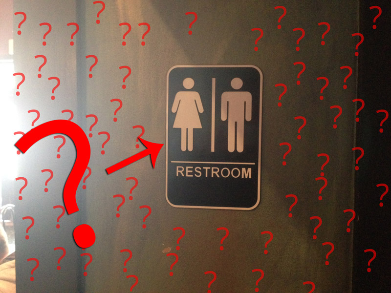
A while ago I had the opportunity to sit in on some meetings where a group was lobbying their state legislators for gender neutral bathrooms. Recently, I attended a town hall where the same issue came up. In both cases, the elected officials were flabbergasted.
One reaction was something along the lines of “This sounds incredibly confusing and difficult. I’m just not sure how we would implement such a thing in government buildings without serious remodeling.”
Another: “But then how will normal people know what restroom to use?”
A third: “OH THE HUMANITY!”
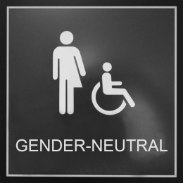 Okay, I made that last one up, but you get the point. Gender neutral restrooms as an idea really freak people out. And I’ve heard people object to some of the signage that’s used when they are actually implemented. The sign to the right is one used at University of Colorado Colorado Springs. I can empathize with why that might be confusing. Most folks might not understand what “gender neutral” means, have never had gender explained to them, and even if you’re familiar with gender identity and diversity [as a visual person myself] the literal interpretation of this image (a half “man” half “woman”) is a disconcerting representation of “gender neutral.”
I was discussing this with an administrator at a university a few days ago and their concern was simple, “When people are looking for a restroom, they look for the ‘man or woman’ icon. It’s what we know to look for that means restroom.”
In the airport yesterday I asked a facility manager about gender neutral restrooms and the above concern was echoed, “But what would you put on the door?!”
WHAT WOULD WE PUT ON THE DOOR, SAM?! HOW CAN WE CONTAIN THE CHAOS?!
I decided to put my super sharp visualization cortex part of my brain to work, to see if I could come up with a revolutionary new sign we could use to signify gender neutral bathrooms.
Introducing: The Sam Killermann Super Innovative Gender Neutral Bathroom Sign

I know I probably need to explain this so you can help walk your state reps, building managers, and administrators through the idea. So let me walk you through the design phase of this graphic step by step, including my thoughts as the designer.
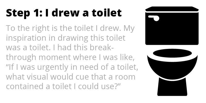
You’re not going to believe this, but like most great ideas, the idea for this toilet design to denote that a room has a toilet actually came to me while I was sitting on the toilet. Serendipity, I’d say.
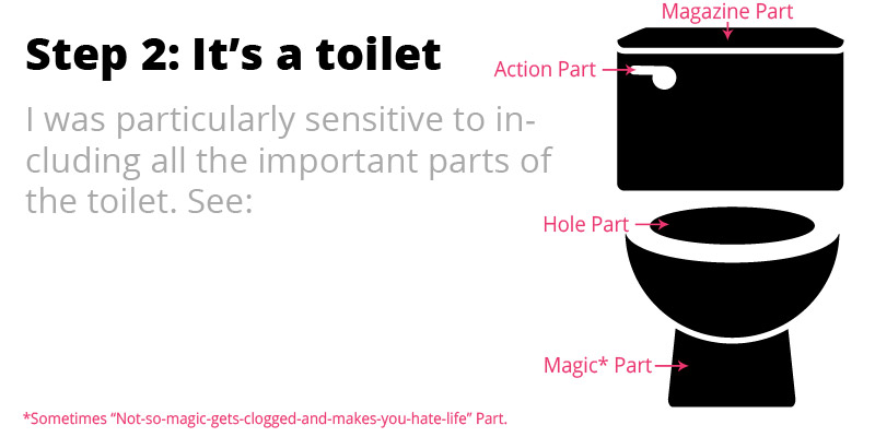
One of the hardest parts of creating innovative, break through visuals to represent complex ideas is being sure you include all the necessary components and dimensions of what you’re trying to convey. I think I nailed it. But I had to be sure…
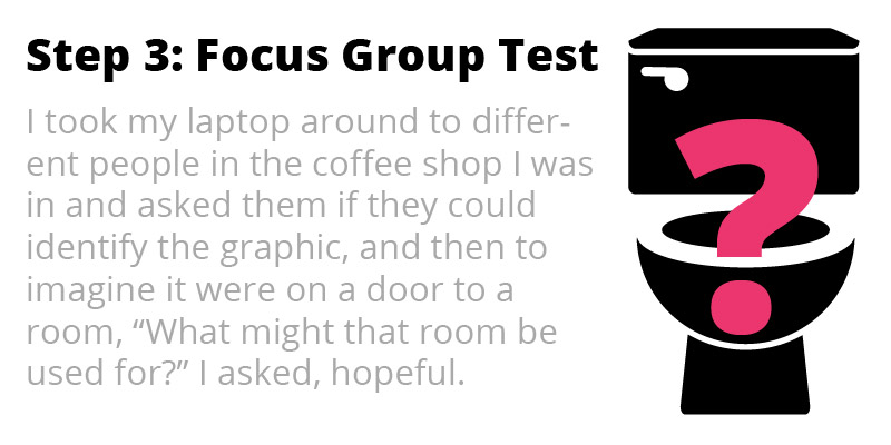
At an alarming, unprecedented 100% success rate, literally every participant in my focus group correctly identified the abstract, gender-neutral concept I came up with to identify a restroom. Granted, my research at this point is limited geographically to Philadelphia, specifically the corner of Sansom & 20th Street, but I have reason to believe that we can generalize beyond this population. I will confirm this as I continue my travels.
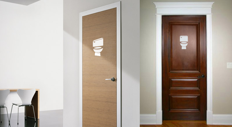
Here are a couple examples of the sign, hypothetically, in action:
Lastly, here it is in a few different colors, to demonstrate the concept’s versatility:
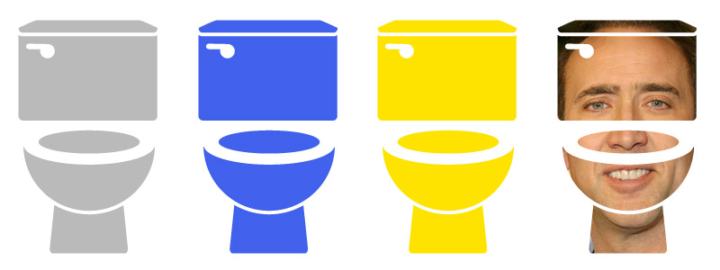
To the final person I surveyed, a self-identified man who begrudgingly gave me his name, Adam, I asked, “If you saw this image on a door, what do you think my be behind that door?”
To which he replied, quickly and confidently, “A person taking a shit. Now can I get back to my lunch?”
Yes you can, Adam. We all can.
Joking Aside, It’s Really Not That Hard
Any one-person, private restroom can (and, I’d argue, should) be a gender neutral restroom. It basically already is. Use whatever sign you’d like, or just do it the British way and put W.C. on the door (I believe it stands for “Who Cares?”).

